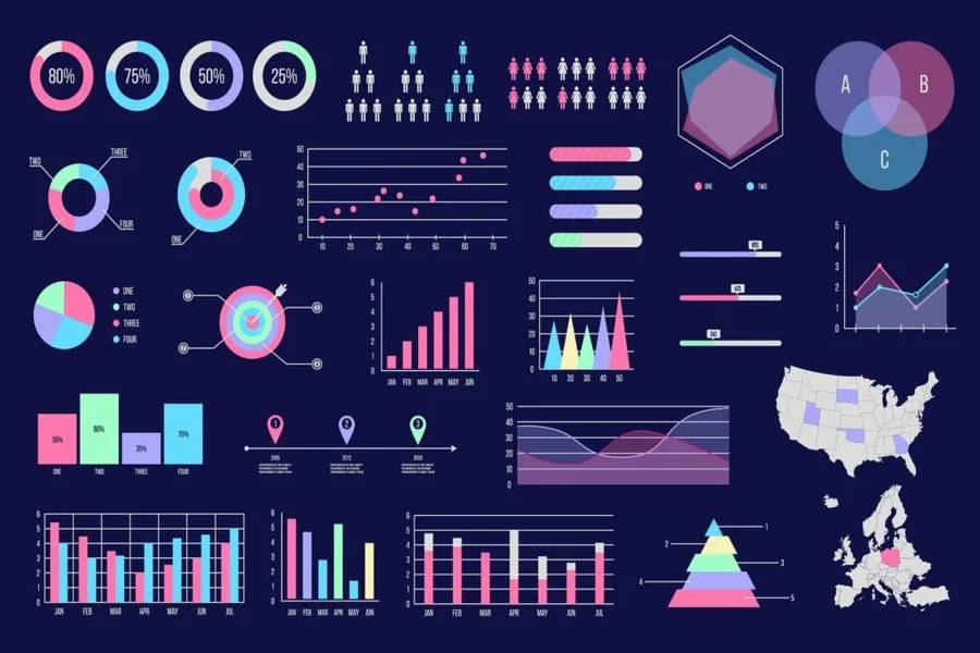
Data alone rarely inspires action. Numbers can overwhelm, but visuals clarify -turning raw information into something people can instantly understand. Whether you’re preparing a business report, a research project, or a classroom lesson, visuals help your audience see patterns, not just read statistics.
That’s why more professionals and students rely on digital visualization tools. By using a chart maker, you can transform spreadsheets into clean, meaningful visuals in just a few clicks. Instead of spending hours manually formatting graphs, these tools automate the process -making data presentation faster, more accurate, and far more engaging.
In a world overflowing with information, knowing how to present data effectively isn’t just a skill; it’s a competitive advantage. Let’s explore how graph makers simplify that process and why they’ve become essential in modern communication.
1. Making Complex Data Easy to Understand
The human brain processes visuals up to 60,000 times faster than text. A well-made graph helps your audience see the story behind your data immediately. Graph makers take complex numerical sets and turn them into patterns -showing growth, decline, or correlation at a glance.
Whether you’re explaining quarterly profits, survey results, or scientific findings, visual clarity helps audiences grasp key insights faster and remember them longer.
2. Saving Time and Reducing Errors
Creating graphs manually in traditional software can be tedious -formatting axes, labeling data points, and aligning colors all take time. A graph maker automates these tasks.
It pulls data directly from your spreadsheet, applies consistent styles, and ensures accuracy with minimal input. This eliminates common human errors, like mismatched scales or incorrect labels, while giving you more time to focus on interpretation instead of formatting.
3. Enhancing Engagement in Presentations
A wall of numbers rarely keeps attention. Graphs, on the other hand, invite curiosity. They simplify complex ideas and add rhythm to your presentation flow.
When you alternate between visuals and text, you create a natural pacing that maintains interest and strengthens understanding. Graph makers also let you customize color palettes and animations to fit your brand or audience style, helping your data feel professional and memorable.
4. Enabling Quick Comparisons and Insights
Graphs allow viewers to spot trends, relationships, and outliers instantly. With a graph maker, you can switch between visual types -bar, pie, line, scatter, or area -in seconds to find the one that communicates your insight best.
This flexibility encourages exploration. You can test multiple formats quickly, helping you uncover angles you might have missed when looking at raw numbers alone.
5. Maintaining Consistency Across Reports
Consistency builds trust. Whether you’re preparing internal reports or client-facing documents, visuals should follow a unified design language. Graph makers store custom templates and branding elements -fonts, colors, logos -to ensure every presentation aligns with your organization’s identity.
This uniformity makes reports look polished and cohesive, reinforcing credibility with your audience.
6. Supporting Collaboration and Real-Time Updates
Many modern graph makers are cloud-based, allowing multiple people to work on the same data visualization simultaneously. As teammates update figures or adjust visuals, changes appear instantly for everyone.
This feature is especially valuable for marketing, finance, and academic teams that rely on shared dashboards or recurring reports. Real-time collaboration keeps everyone on the same page -literally.
7. Improving Decision-Making
Data visualization isn’t just about presentation; it’s about clarity in decision-making. Executives, clients, or researchers can evaluate information faster when it’s visualized properly.
For example, seeing a trend line that dips below target instantly signals where to take corrective action. With clear graphs, decisions shift from assumptions to evidence-based insights.
8. Encouraging Data Literacy
As organizations become more data-driven, being able to interpret and communicate through visuals is an essential skill. Graph makers democratize data literacy -allowing non-analysts to create visuals confidently without coding or advanced training.
This empowerment encourages teams across departments to engage with data more actively, fostering a culture of informed collaboration.
9. Integrating With Other Tools
Most graph makers integrate smoothly with analytics and presentation platforms. You can import data from spreadsheets, databases, or business dashboards and export visuals directly into slides or reports.
This seamless workflow reduces manual copy-pasting and ensures your charts remain accurate even when data updates -a major time saver for professionals handling dynamic datasets.
10. Visual Storytelling With Impact
Numbers are facts; visuals are stories. A strong graph connects those two worlds. With clear visuals, you can highlight key takeaways, reveal progress, or persuade stakeholders to act.
Graph makers simplify storytelling by letting you arrange visuals in logical sequences -cause to effect, problem to solution, past to future. The result: presentations that don’t just inform but inspire.
Conclusion: Turning Data Into Understanding
In a world where data drives every decision, presentation quality can determine whether your message resonates or fades. Graph makers bridge the gap between analysis and communication -helping you present information with confidence, clarity, and creativity.
When you use a chart maker, you’re not just building graphs; you’re crafting visual stories that move people to think, understand, and act.
The next time you face a spreadsheet full of numbers, remember: insight begins when data becomes visible.